Objectives:
1) Take a photo of graffiti around town.
2) Incorporate a street light into the photo by using parts of a photo on photoshop.
2) Incorporate a street light into the photo by using parts of a photo on photoshop.
Research:
|
|
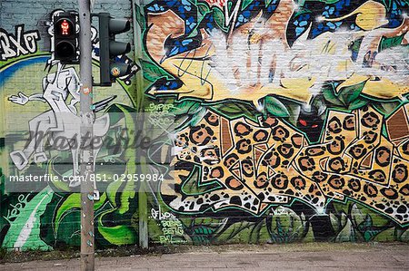
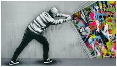
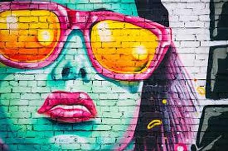
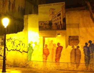
These images are giving me ideas to incorporate some sort of light into the photo whether it's from a traffic light or a street lamp. There are also different images that come out of the day time and night time.
20 New Photos:
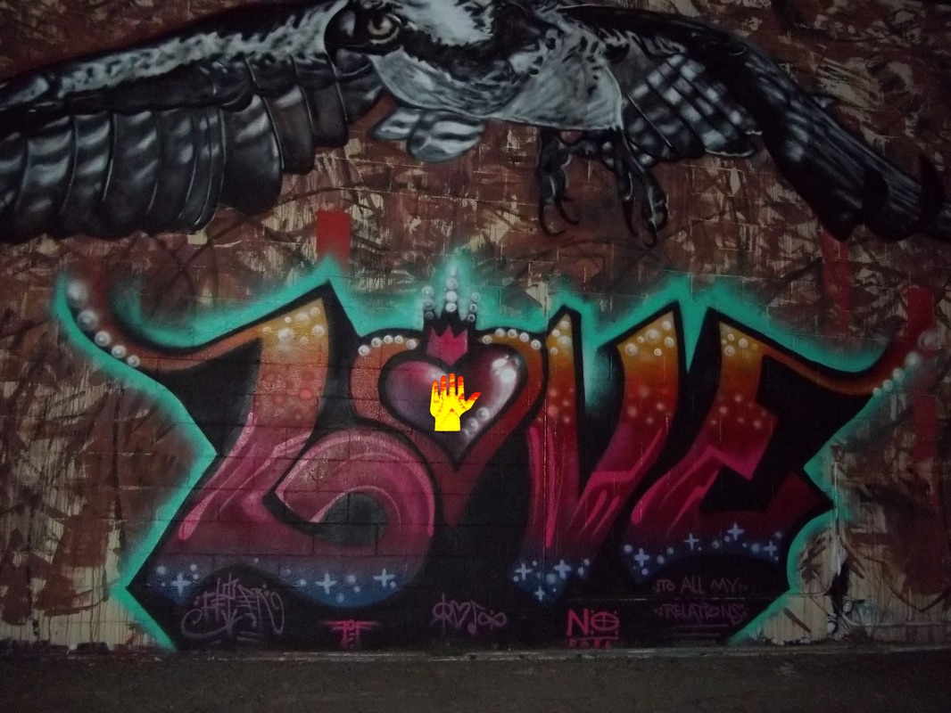
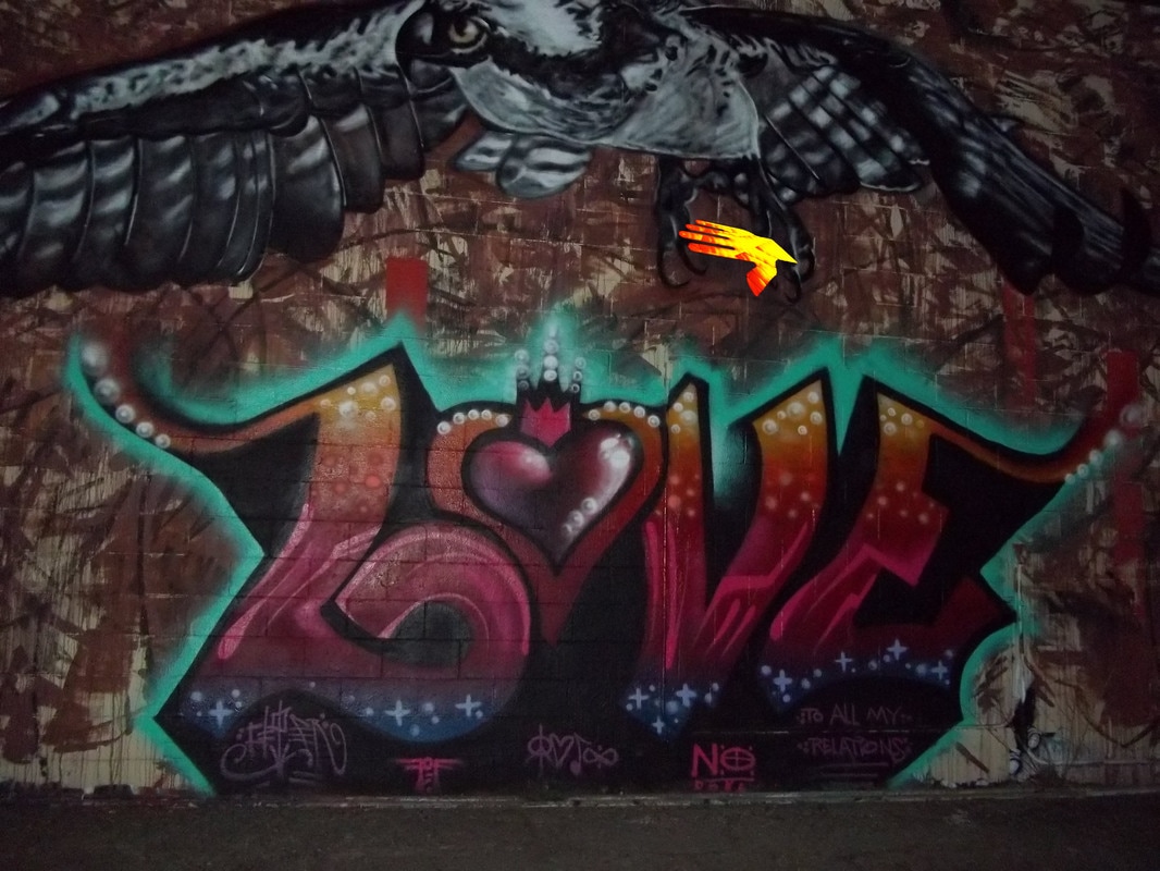
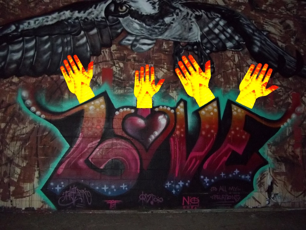
4 Edited Photos:
|
|
Printed and Matted Photo:
5 Step Critique:
Step 1: OBSERVE
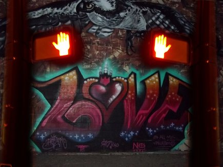
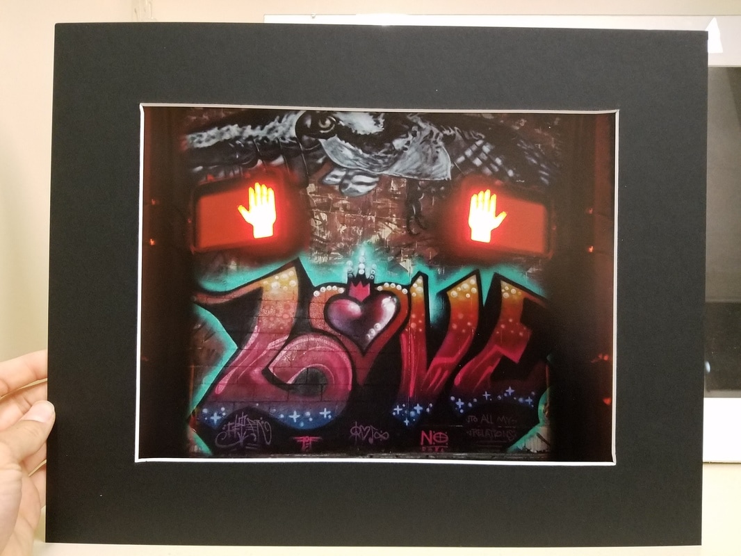
This piece is symmetrical in the way that the street post is reflected over to the other side of the image. In the background is the word 'LOVE' that is the main part of this photo. Above the word 'LOVE' is a hawk spanned all the way across the top.
This piece is symmetrical in the way that the street post is reflected over to the other side of the image. In the background is the word 'LOVE' that is the main part of this photo. Above the word 'LOVE' is a hawk spanned all the way across the top.
Step 2: DESCRIBE
This is a photo of graffiti found on the streets of Durango, CO with the word 'LOVE' in the center of the image. The letters are filled in with warm colors starting with yellowish/orange, fading down to red and then to a purple/blue. The 'O' is in the shape of a heart with a crown that sits on top of the heart in the middle. Behind the word 'LOVE' is a blue glow. It outlines the word as it fades outward to look as if it is glowing. Right above 'LOVE' is a hawk that is spanned out across the top. The hawk is white, black, and grey with its head turned to the left. On each side of the photo are 2 street posts with the pedestrian red hand that means "Do Not Walk". The post was reflected over to make the image look symmetrical. The red hands are faced inward with the post on the outside of the image. The posts are also a bit out of focus to make it look like the posts are closer than the wall of graffiti and to not take your eye away from the main part of the image (the graffiti).
Step 3: ANALYZE
An element of design that sticks out to me is color. The contrast between the warm colors used to fill in the word 'LOVE' and the dark background makes LOVE pop out. The bottom of the image also contrasts with the top because of the grey tones used on the hawk. All of the colors seem to match in some way, making it seem more cohesive. Though there are many different colors in this piece, the color that stands out to me most is the bright electric blue behind the letters. This adds a nice accent to the photo. A principle of design that comes from this photo is balance. The hawk on the top and the letters on the bottom add nice balance to the image because they are of similar size so it creates the illusion that it's balanced from the top and bottom. It is also balanced from the right side to the left. Because the street light is on both sides and it is reflected, it adds more balance to the photo, making it look symmetrical.
Step 4: INTERPRET
LOVE is the main focus of this piece. The big colorful letters that span across the bottom convey the message that love is the most important thing. The 2 hands that are on each side represent that we just need to stop sometimes and pay more attention to what is really important in life. The reflection of the street post represents that we need to find balance in our lives.
Step 5: JUDGEMENT
I think this piece was successful in conveying the message that we need to stop and notice what is in life. The bright red hands on each side draw your eyes outward and then the colorful letters in the middle draw them back in. The way that the street posts are a little out of focus and the letters are in focus represents that stopping to take time to notice important things should always be in the backs of our minds and are not always in focus, but then when we recognize that, then the important things will become clear.
