Objectives:
1) Take a photo of the view over the Canyonlands.
2) Play with perspective.
2) Play with perspective.
Research:
|
|
|
|
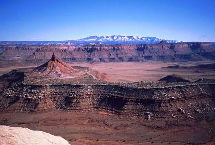
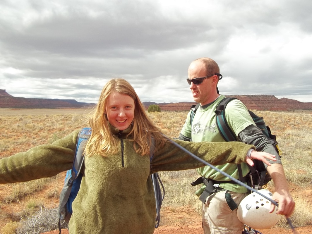
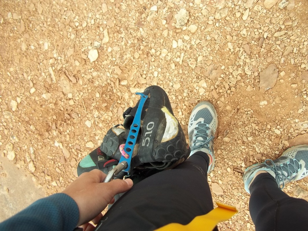
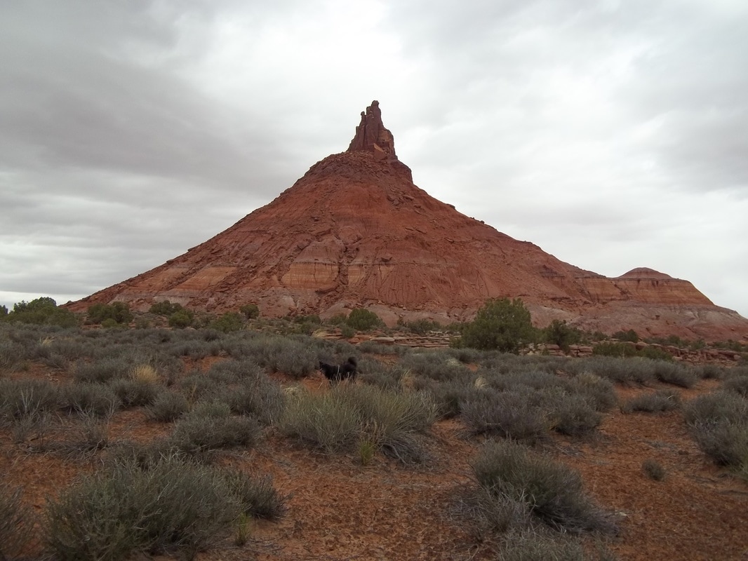
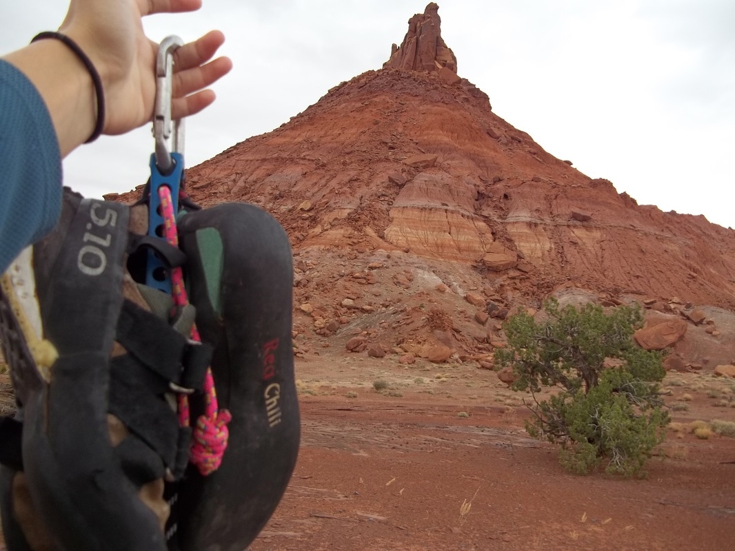
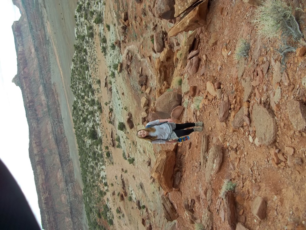
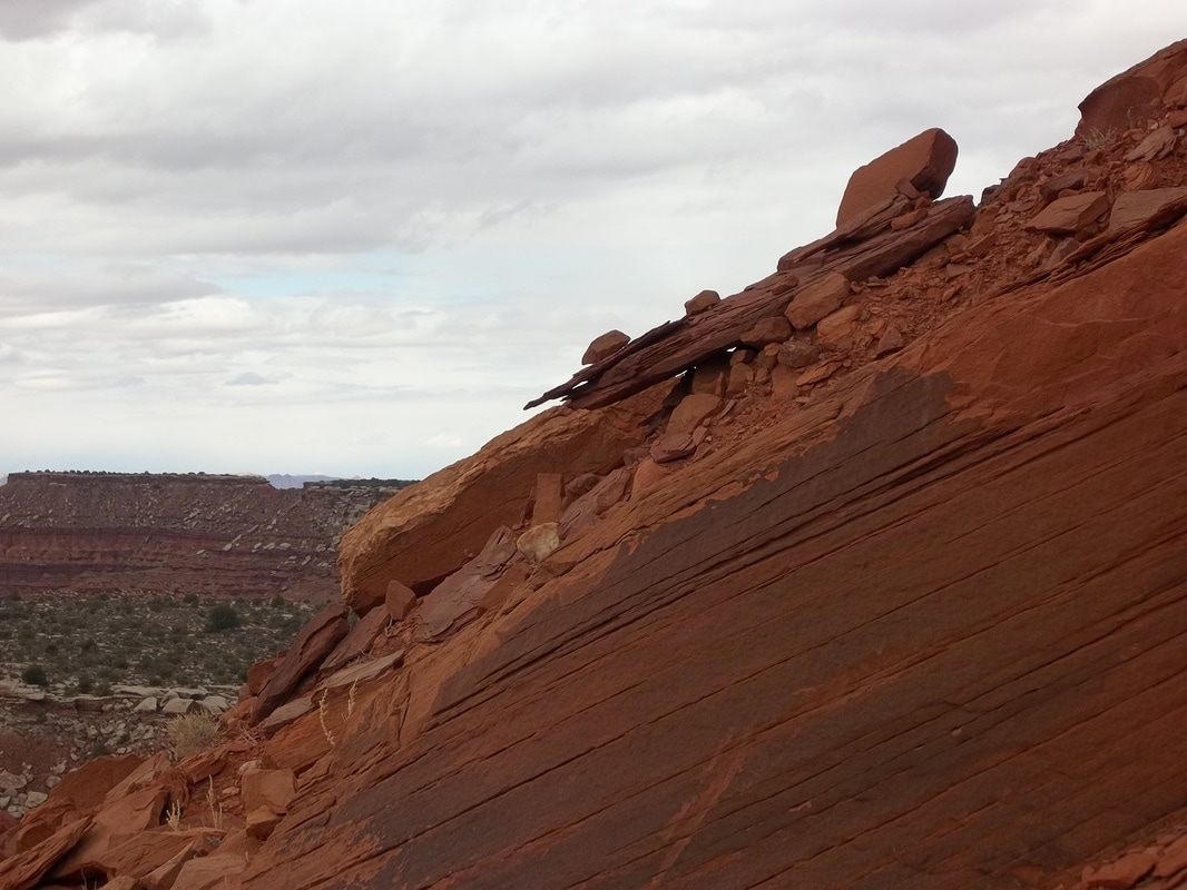
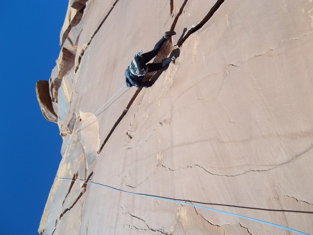
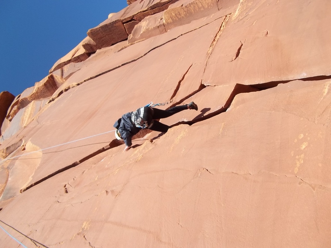
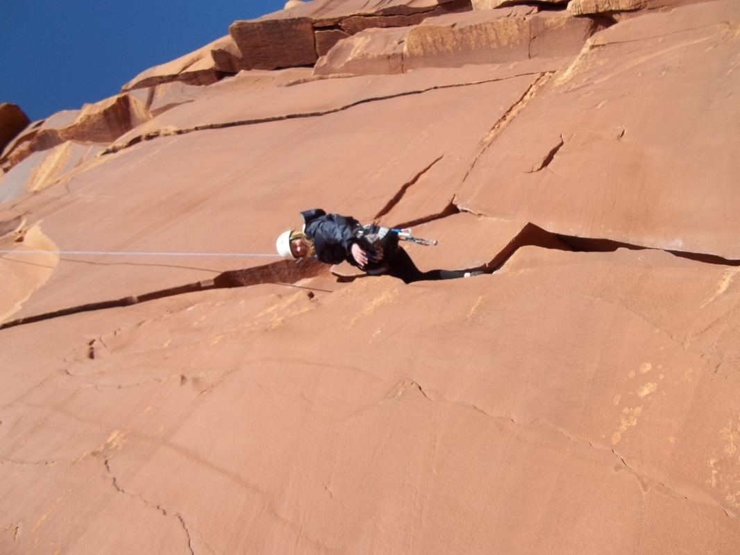
There are so many picture that I can take while I am in the desert and so many rock formations. I want to take a picture of the canyons from the top of South Six Shooter while having something personal in the image. I think it would be cool to have my friend doing something in the photo with canyons in the background.
20 New Photos:
4 Edited Photos:
|
|
Printed and Matted:
5 Step Critique:
Step 1: OBSERVE
Step 2: DESCRIBE
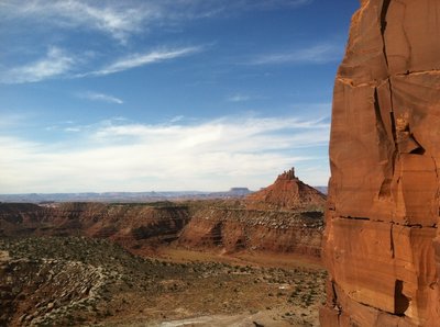
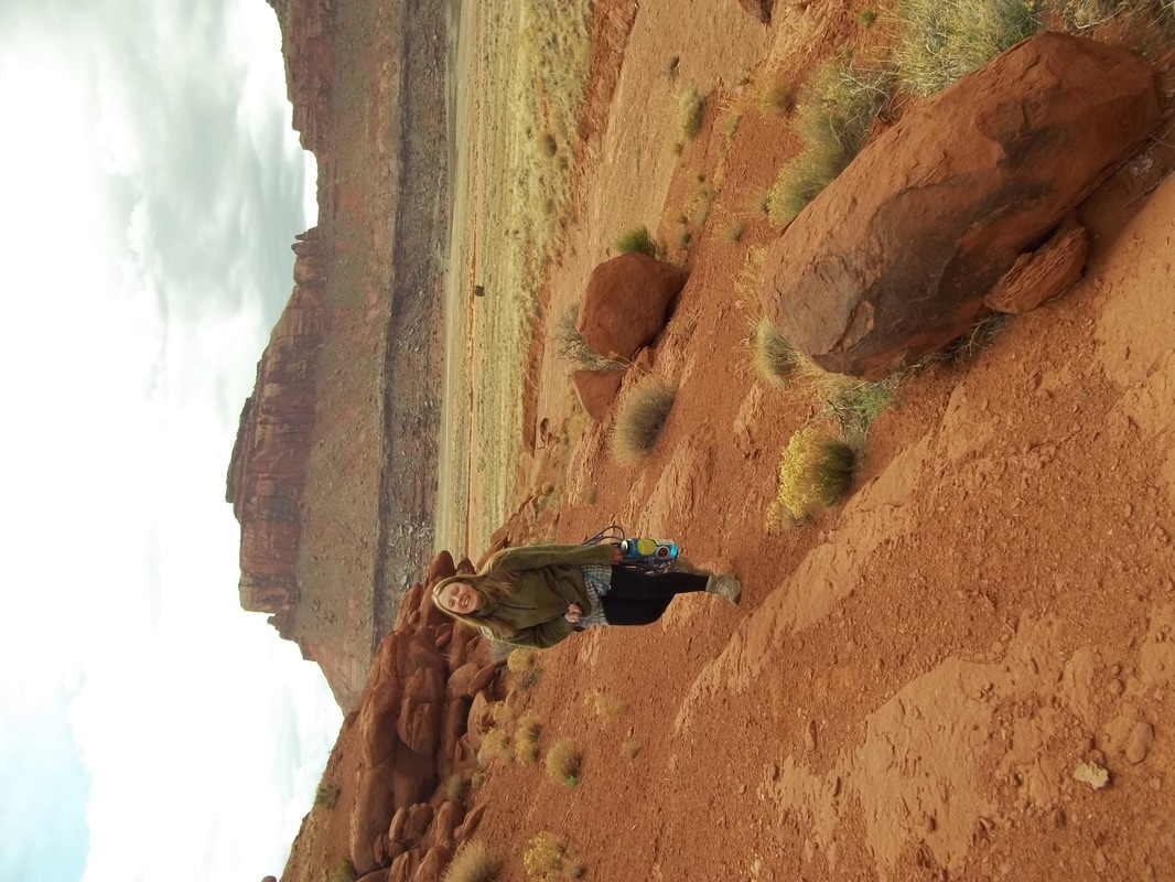
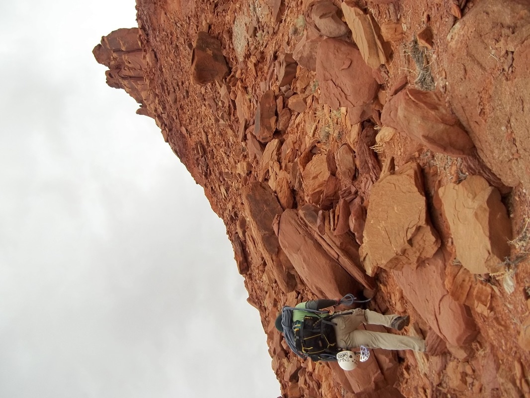
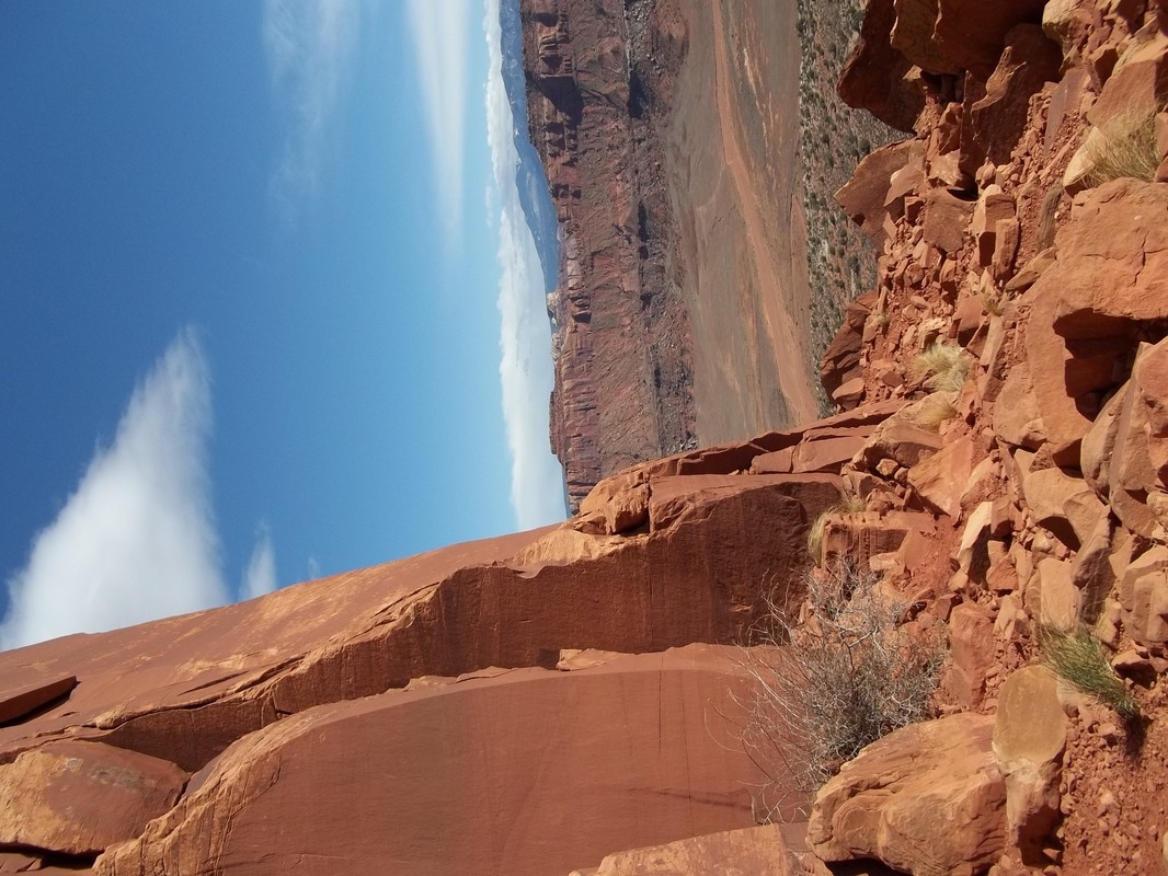
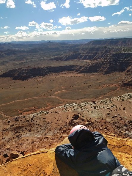
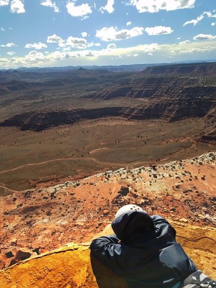
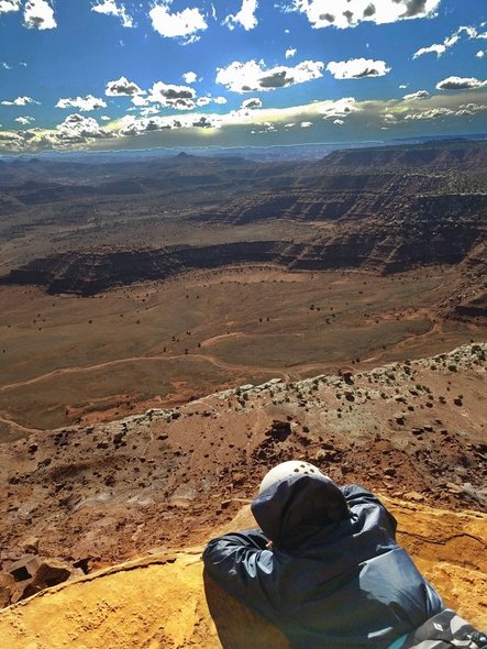
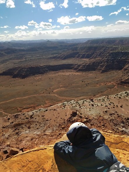
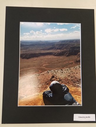
This is a photo of my friend Sierra at the base of the tower and the top of the cone of South Six Shooter in the canyonlands. Shy is lying on her stomach on top of a large flat rock, looking out over the canyons. Down below is what looks to be a thin tan line that spans across the land but is actually a road. Past that are some shrubs that have grown across the flat land that eventually meets up with the canyons in the distance. The sky is partly cloudy, adding to the contrast between colors throughout the photo.
Step 3: ANALYZE
I think the strongest principle of design in this image is focal point. Because this picture was taken at this perspective, it draws the viewer's eyes to my friend first because she is the closest to the camera, Then the eye is drawn out towards the canyons in the distance. I think that the element of design that compliments this is color. This is because the contrast between the dark blue jacket that my friend has on and the bright orangish yellow rock draws your eye to that first and then out into the land beyond.
Step 4: INTERPRET
This photo was taken to represent how small we are in this big world. It was also taken to show how we can feel on top of the world when we achieve something great. Because my friend is looking out into the distance, it shows how small we are because it gives some perspective and how that sense can be humbling. We should appreciate the moments that life gives us.
Step 5: JUDGEMENT
I believe that this photo was successful in conveying the message that we are small compared to the world around us because of the perspective the photo was taken. The perspective and focal point in the photo really shows what is out there and our size in relation to everything else. I also think the brightness was perfect in this photo because it added just enough light to the foreground without washing out the colors.
